Awai Shoten is a local trading company that started in Anan City, Tokushima Prefecture. Thanks to everyone's support, today, July 1st, marks our third anniversary.
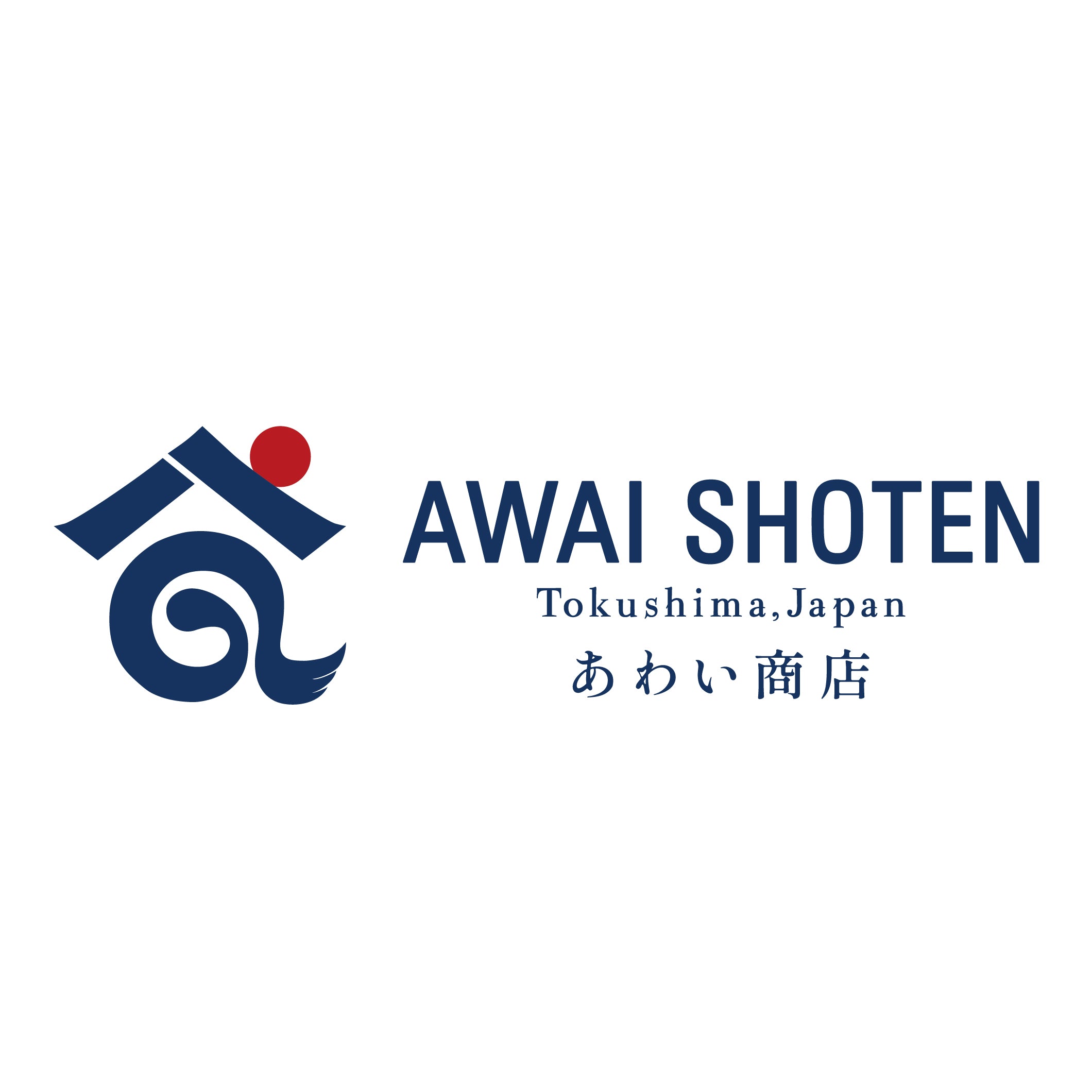
We have revamped our logo in order to better convey to even more people the things we cherish and the feelings we have for our beloved Anan and Tokushima region.
The concept of the logo is based on motifs that evoke Tokushima's nature, such as the sun, mountains, and sea. The "8" at the top represents a shop (roof), widening prospects, and good fortune, while the "a" in the middle represents connection, harmony, gap, connecting, and cooperation.
The color is a double green, an old indigo dye color, reminiscent of Tokushima and Japan. The red of the sun is a traditional Japanese color called madder red, which goes well with indigo and has been popular since ancient times.
Although we are a company that started in Tokushima Prefecture, this logo embodies our determination and resolve to widely disseminate Japanese history, traditions, and culture, even to the rest of the world.
We will continue to work hard to become a company that is loved by everyone. Thank you for your continued support.


